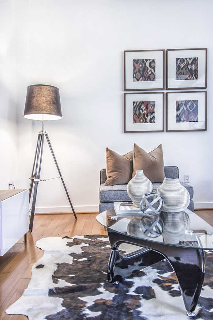
Proven styling tips for a polished interior
The trend of home staging has picked up momentum in recent years. As a stylist, I can certainly appreciate the basic principles behind a well-staged home, whether you’re planning to stay or sell your home. Rule #1 is, you only have one chance to make a good first impression.
Here are some of my favourite styling tips to ensure you make a lasting impression, for all the right reasons.
Step one is to view your home from the street. What’s the first thing you see? Bingo – the front door! This can be just the right feature to invite guests in or send them running for the hills. Choose a vibrant colour that sets your home apart from the rest, and ensure the hardware is bright and buffed. Finish the entry with colourful potted plants on either side for the ultimate welcome.
Next, assess everything you see inside the home, from the walls and furnishings to the accessories, because even the seemingly minor details matter.
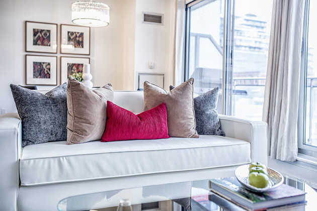
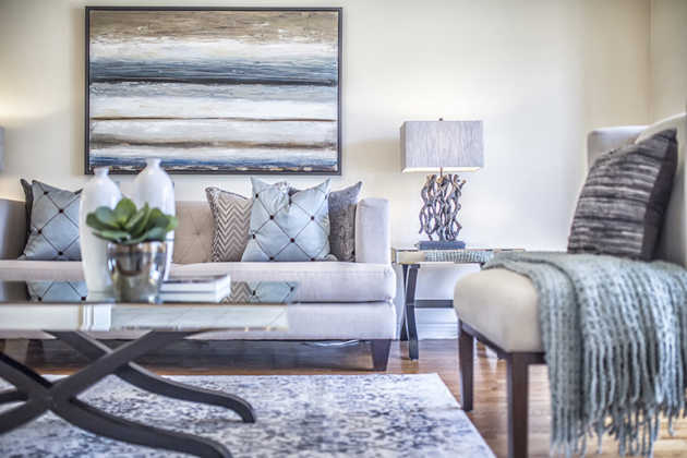
A neutral colour palette is easy to work with and has wide appeal. This applies to your walls and furniture – particularly the big, expensive items that won’t be frequently replaced. Then, incorporate colour through your accessories.
TIP: Artwork is a great way to incorporate colour without commitment!
When planning where to place furnishings and accessories – like art – look for the room’s natural focal point, and focus attention to that. A focal point is a place for the eye to rest. This could be a fireplace, a window or an interesting architectural feature. If your room doesn’t have one, make your own! Stand in the doorway, look into the space and see where your eyes naturally land. This is most likely your room’s focal point, and a good place to focus your furniture arrangement.
Now that you’ve identified the obvious attention-grabbers in your space, consider the background elements, such as lighting and flooring.
The most beautiful furnishings and artwork will be lost without proper lighting. A good lighting plan includes elements of ambient, task and accent lighting, and layered at a variety of heights – floor, tabletop, sconce and ceiling.
Underfoot, stylists typically use rugs to highlight a room, increase visual impact, or to create division and definition within an open-concept layout. With that said, resist the urge to overuse rugs. They’ve certainly become a trendy piece, and are even appearing in layers, with one overlapping another. Tread carefully, as it’s a fine line between just enough and over-the-top.
Last but not least, plan your accessories. Be selective; choose pieces that make you smile, help tell your story, or inspire you in some way.
One of my go-to tricks is to arrange accessories in odd numbers. Don’t ask why this works, it just does. There’s something visually pleasing about groupings of three or five. To add more interest, use books or stacked magazines to vary height.
A beautifully styled space is a careful balance between the big, obvious pieces that attract the eye, and the small, subtle details that evoke good feelings. If you walk into a room and something seems "off," explore the elements above and you’ll likely find the missing link. When all the elements in a space work together, a room becomes "home."


