


If you had to pick a colour that best depicts the year we’ve just had, what would it be? Was 2020 red, or maybe blue? Grey?
At the beginning of each year, the colour forecasters at the Pantone Color Institute — which predicts trends and creates international standards for colour — choose a colour that they believe will be trending globally over the following twelve months.
For the past 22 years, its colour of the year has influenced product development and purchasing decisions in industries including design, fashion, entertainment, architecture, appliances and more.
But to arrive at the perfect selection every year, colour experts comb the world looking for new inspiration. This endeavour is a year-long process that usually involves a lot of travel all over the world to suss out how colours are being used in different settings, from travelling museum shows to the colours of the latest cars.
It requires thoughtful consideration and trend analysis of everything from the entertainment industry to new art collections, popular travel destinations to fashion, all areas of design as well as socio-economic conditions.
Ultimately, it results in designers and manufacturers being on the same page whether they make bike helmets or sofas and eventually, the chosen colour starts popping up in everyday life on things like the websites you visit and the shoes that you buy.
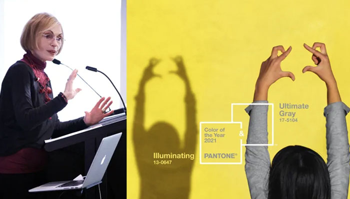
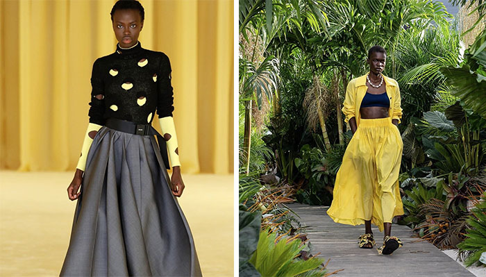
This year, Pantone has broken tradition for the second time and announced two colours of the year for 2021 — Ultimate Gray and Illuminating, a shade of yellow.
Leatrice Eiseman, a colour specialist and the executive director of the Pantone Color Institute, joined q‘s Tom Power to talk about how the 2020’s chosen colour fared, the reasons and psychology behind choosing two colours this year and how the unpredictability of our times impacts trend forecasting.
The year that was in anti-anxiety blue
At the beginning of 2020, before any of us knew that it would end up being the dumpster fire that it was, Pantone predicted that colour of the year Classic Blue would be all the rage.
A website called The Cut aptly called it an anti-anxiety blue and in 2019, when Eiseman first came to q, she said: “Blue is the colour that gives people pause to take a deep breath; they can relax… When the world is kind of winding down, we’re hoping we’re going to get a little more rest and peace and tranquillity.”
In a year defined by the COVID-19 pandemic, Eisemean says that the response to the Classic Blue in 2020 was positive and “just amazing because we know that, universally, blue is the favourite colour.”
Contrary to the negative connotation when the word blue is used to describe feeling depressed, Eiseman says the institute’s colour-word association studies prove that blue elicits positive emotions.
“Even though the world was, you know, not giving us very good messages, we got some solace by having some blue around us. That was a help.”
Secrets behind the colours of 2021
Asked whether the contrast between the two emotions that this year’s colours denote is what makes them right for 2021, Eiseman said the choice is symbolic of “a message of strength and hopefulness that’s both enduring and at the same time uplifting.”
These colours convey the idea that it’s not about one colour or one person, says Eiseman. “It’s all about more than one. And that’s really an important statement.”
“Because we know that, last year, anxiety was growing about the pandemic, we felt that it was important to have two colours that would show this union of colour that could then symbolize our need to reach out and connect with others. So at least that was our hope. And that was the reasoning behind it.”
Additionally, grey stands for practical and rock solid, the yellow for warmth and optimism — a combination that gives us some degree of resilience and hope, explains Eiseman.
“We know that we need to feel encouraged and uplifted, and this is essential to the human spirit. So the symbolism struck us as a very strong point to make with the two colours.”
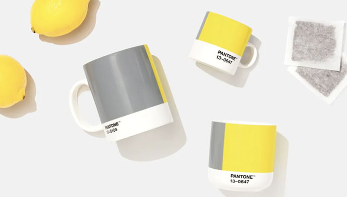
Ultimate Gray
Characterizing it as dependable and very practical, Eiseman says “there’s always that grey that’s just right in the middle, that seems to work with so many other things. And that’s why we called it Ultimate Gray. It is that almost perfect neutral grey.”
“Anyone that’s ever had a pair of grey pants or grey sweater that you’ve had forever, you know, you can pull anything out of the closet and wear with it. And you never say, ‘Oh, it clashes it doesn’t go.’
“It’s also, in the human mind, attached to those things that give us a solid foundation: the pebbles on the beach, the granite, the rock, the stone — those things that have been around for eons.”
Illuminating
Described as a lemon yellow, Illuminating was chosen to elicit brighter and more positive emotions.
“I think people are really hungering for that glimmer of sunshine,” says Eiseman, noting that people connect vibrant yellows with sunshine and light.
“From the time we’re little kids, we always have a positive association with that. The sun is out and you look out the window and your mom says, ‘Okay, you can go outside and play; look at what a beautiful sunny day it is.’ …We’re hopeful of that sunny day, the light at the end of a tunnel.”
The combination of the two colours adds a little edge to any design from clothing to digital equipment, says Eiseman. And if you’ve been stuck inside for a long time, she suggests adding a little sunny yellow to your environment.
She has it throughout her home near Seattle, where winter is very often grey. “I want to trick the eye into believing that there is sunlight when in fact there isn’t.”
If not yellow, then perhaps something in the apricot family, something that has that degree of warmth. And it will, I promise you, make you feel better.”
Two colours were chosen only once before
Some of the past selections for colour of the year include Living Coral in 2019, Ultra Violet in 2018 and Greenery in 2019. But in the 22 years that Pantone has been selecting a colour of the year, there’s only been one other time when the institute has chosen two. It was in 2016 when Rose Quartz (a soft pink) and Serenity (light blue) shared the honours.
“At the time that we did the blue and the pink, there was a reason behind that. That was the feeling that we were really entering — not that we haven’t been there for a while but that whole wellness in zen-like period that we were looking at — where we needed something soft and, kind of, quiet to rely on.”
“The world seemed to be whirling around, even at that time. Primarily, because of the whole digitized world. And everything was happening so fast and furious. We needed something soft and quiet to kind of release that.
“It was also a way of expressing kind of a non-gender identification with the two colours — that strong men, yes, they can wear pink. It’s OK for a guy to put a pink shirt on. Women have always gotten blue; they understand that colour so it was kind of a melding of the sexes at the same time.”
More colour predictions for 2021 based on challenges of 2020
Although 2020 was far more limiting for everyone due to COVID-19 — and distinctly lacking in red carpets, fashion shows and travel — Eiseman had no trouble when it came to choosing the colours of the year.
“Colourists spend their lives involved in colour. I am particularly involved in the psychology of colour. … And for me, this symbolism is always the leader. And as you look at the zeitgeist, the world around you, it takes you on a path very quickly. So it is not a difficult job for someone who is almost intuitively trained to do this. “
Communication with colleagues all over the world flowed seamlessly over Zoom, says Eiseman, and she had no issues getting clues and inspiration. “Even the trade shows that we used to go to in Paris and Milan and all the areas that we travelled to are sending out all kinds of information that we can glean from.”
While 2021 holds a lot of unknowns, she predicts colour is going to go in two directions in 2021, given people have been stuck at home so much.
“Either they’re going to feel very comfortable in their surroundings and, you know, have really cocooned in that area, or they’re going to say, ‘I am so tired of looking at these four walls, I need new colour in my life.’
“And I think we’re going to have a lot more of that kind of reaction to people wanting to at least repaint or bring something fresh and new for their eye to land on to give them the feeling that 2021 is going to be better than 2020.”
Written by Vanja Mutabdzija Jaksic. Interview produced by Cora Nijhawan.
Note: The conversation was condensed and edited for clarity and context.
Source: www.cbc.ca


